
uni fags...what happened?
-
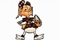
The elf is the gayest thing since gay came to gaytown. The only other logo possibly approaching its lameness is the rakish dandy that was the Tampa bay buccaneer. In fact do a google image search "worst NFL football logo" what's the very first result?
Redskins came up.
But despite your immense scientific research ... Browns fans like the elf.
They can bring on new logos and new uniforms, nobody gives a shit, really. But the helmet, the colors, and the elf ... will never go away.
Zombo
Zombo said:
Redskins came up.
But despite your immense scientific research ... Browns fans like the elf.
They can bring on new logos and new uniforms, nobody gives a shit, really. But the helmet, the colors, and the elf ... will never go away.
Zombo
I don't care if it stays, goes, or blows the buccaneer at the 50 yard line. It's a stupid logo though.
I suppose beauty is in the eye of the beholder. I happen to love the elf too. I was trying to find a picture of that 20 foot high elf that used to adorn the outside of old Municipal Stadium, but failed. BTW, many of us oldtimers believe the downward spiral of the Browns in the late 60s was in part due to Modell mothballing the Elf. He may be gay, but he's good Karma.
Now that Keebler incarnation they brought back this year does need some toughening up.
-
The only way to make a uniform thread more gay is to add the words "soccer" and "European".
-
The only way to make a uniform thread more gay is to add the words "soccer" and "European".
The only way to make a uniform thread more gay is to add the words "soccer" and "European".
The only way to make you less gay is to pull the dildo out of your ass.
-
Lol, good one?
-
One thing we can agree upon. The elf is as lame as logos can possibly get
The elf is awesome.
Zombo
-
I personally think this design is awesome.
http://www.footballasfootball.com/cleveland
It's a website that redesigns American football logos as if they were European soccer teams.
I personally think this design is awesome.
http://www.footballasfootball.com/cleveland
It's a website that redesigns American football logos as if they were European soccer teams.
Not that impressed with what they have. Only decent one is the B in the Bullseye. But that is not as good as the one we already have, the B in the football.
-
I personally think this design is awesome.
http://www.footballasfootball.com/cleveland
It's a website that redesigns American football logos as if they were European soccer teams.
Not that impressed with what they have. Only decent one is the B in the Bullseye. But that is not as good as the one we already have, the B in the football.
Not that impressed with what they have. Only decent one is the B in the Bullseye. But that is not as good as the one we already have, the B in the football.
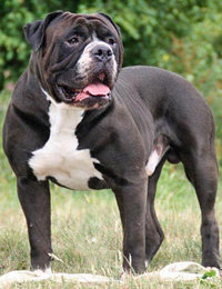
Really? I like the one with the bulldog or bulldawg as it were. It's been our unofficial mascot for so long that I wouldn't mind incorporating it a little more. NOT on the helmets.
-
You never had a case
You never had your car.
-
You never had a case
You never had your car.
You never had your car.
Too soon
-
I personally think this design is awesome.
http://www.footballasfootball.com/cleveland
It's a website that redesigns American football logos as if they were European soccer teams.
I personally think this design is awesome.
http://www.footballasfootball.com/cleveland
It's a website that redesigns American football logos as if they were European soccer teams.
lot better than anything i've seen in a while. of course we are talking patch on the jersey. nothing ever on the helmet.
the B in the football is ok but still a little too busy.
a lot of times less is more. (no sexual references inferred).
I like that the guy who threatened to trace my ip and come beat me up (good luck) because I suggested the browns might add a different color into their uniform scheme thinks I'm delusional. That makes total sense.

-
The English patch idea would make it look like were copying Baltimore. I hate Baltimore, but I do have to admit their shield patch is pretty cool.
-
Bump bwaahhhaaa
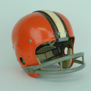
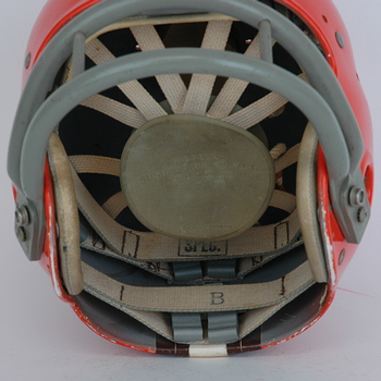
keep the same helmet colors but use the throwback "bell ringer" style
-
I didn't realize they had a ridge that went down the center of the helmet like a Mohawk. Tuff sons of bitches.
The secret of getting ahead is getting started. The secret of getting started is breaking your complex overwhelming tasks into small manageable tasks, and then starting on the first one. -Mark Twain- "It's not the size of the dog in the fight, it's the size of the fight in the dog." -Mark Twain- -
I didn't realize they had a ridge that went down the center of the helmet like a Mohawk. Tuff sons of bitches.
-
I didn't realize they had a ridge that went down the center of the helmet like a Mohawk. Tuff sons of bitches.
-
here are alternative logos for all 32 teams. Raiders one look good. We have a bulldog that looks constipated. http://cdn.fansided.com/wp-content/blogs.dir/229/files/2013/09/nfllogos.jpg
-
here are alternative logos for all 32 teams. Raiders one look good. We have a bulldog that looks constipated. http://cdn.fansided.com/wp-content/blogs.dir/229/files/2013/09/nfllogos.jpg
here are alternative logos for all 32 teams. Raiders one look good. We have a bulldog that looks constipated. http://cdn.fansided.com/wp-content/blogs.dir/229/files/2013/09/nfllogos.jpg
I like the bulldog. The redskins titans and buccaneers logos are pretty badass as well, but my favorite part is that the steelers logo is gayer than AIDS.
-
I'm awesome, and I fuck dolphins. Ghoolie 12/2/2012: I have absolutely no skills, training or pride
-
Being a SW-Browns fan, this is pretty cool. Nicely done too.





Hello! It looks like you're interested in this conversation, but you don't have an account yet.
Getting fed up of having to scroll through the same posts each visit? When you register for an account, you'll always come back to exactly where you were before, and choose to be notified of new replies (either via email, or push notification). You'll also be able to save bookmarks and upvote posts to show your appreciation to other community members.
With your input, this post could be even better 💗
Register Login