
Cool Browns concept art.
-

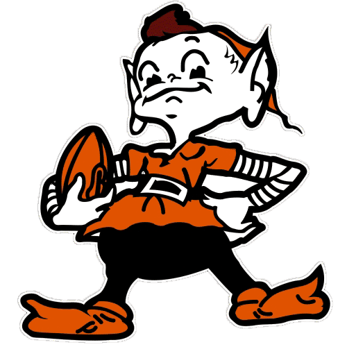
This is as good as any logo we have
Early man walked away as modern man took control. Their minds weren't all the same and to conquer was their goal. So He built his great empires and he slaughtered his own kind, and he died a confused man and killed himself in his own mind... -
This is as good as any logo we have
-
It is, sadly.
-
Ditto!
-
This is as good as any logo we have
This is as good as any logo we have
garbage.
-
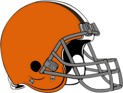
Of all those logos I only really like the helmet. The elf is classic so it's ok. But really they all are not very good.
-
Let's see you come up with something better mik. I'll give your standard bullshit answer for you
"Uh...I would but I don't work for free"
-
Translation "I can't because I'm better at talking shit than doing it"
Early man walked away as modern man took control. Their minds weren't all the same and to conquer was their goal. So He built his great empires and he slaughtered his own kind, and he died a confused man and killed himself in his own mind... -
Translation "I can't because I'm better at talking shit than doing it"
Translation "I can't because I'm better at talking shit than doing it"
wha wha what?
wow, who pissed in your wheaties?
-
I dig the simplicity of the logos. Some of the hats and shirts these days have to much going on.
-
like i said i like the intertwined C and B the guy had up on his mock up page. BUT intertwined typeface is only used in baseball the majority of the time (don't know why).
give me a simple block varsity typeface B embroidered in orange on a brown hat and i'm happy.
if anyone was thinking this shit would go on a helmet then i'd say you're sadly mistaken.
i don't understand though why when they do the throwback uni sundays the browns never go with the white ones worn way back in the day. almost looks like penn state. can't tell by the pics but i wonder if they were white with dk brown?
-
like i said i like the intertwined C and B the guy had up on his mock up page. BUT intertwined typeface is only used in baseball the majority of the time (don't know why).
give me a simple block varsity typeface B embroidered in orange on a brown hat and i'm happy.
if anyone was thinking this shit would go on a helmet then i'd say you're sadly mistaken.
i don't understand though why when they do the throwback uni sundays the browns never go with the white ones worn way back in the day. almost looks like penn state. can't tell by the pics but i wonder if they were white with dk brown?
like i said i like the intertwined C and B the guy had up on his mock up page. BUT intertwined typeface is only used in baseball the majority of the time (don't know why).
give me a simple block varsity typeface B embroidered in orange on a brown hat and i'm happy.
if anyone was thinking this shit would go on a helmet then i'd say you're sadly mistaken.
i don't understand though why when they do the throwback uni sundays the browns never go with the white ones worn way back in the day. almost looks like penn state. can't tell by the pics but i wonder if they were white with dk brown?
Those throw back unis are some dumb shit.....1/2 of them were never even REAL uniforms.....
The Squealers one below has to be the ugliest ever....
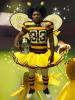
-
yeah i know. but it's one way to shut up all the little queefs about their uni change fetish.
nice pic btw. lol.
-
like i said i like the intertwined C and B the guy had up on his mock up page. BUT intertwined typeface is only used in baseball the majority of the time (don't know why).
give me a simple block varsity typeface B embroidered in orange on a brown hat and i'm happy.
if anyone was thinking this shit would go on a helmet then i'd say you're sadly mistaken.
i don't understand though why when they do the throwback uni sundays the browns never go with the white ones worn way back in the day. almost looks like penn state. can't tell by the pics but i wonder if they were white with dk brown?
like i said i like the intertwined C and B the guy had up on his mock up page. BUT intertwined typeface is only used in baseball the majority of the time (don't know why).
give me a simple block varsity typeface B embroidered in orange on a brown hat and i'm happy.
if anyone was thinking this shit would go on a helmet then i'd say you're sadly mistaken.
i don't understand though why when they do the throwback uni sundays the browns never go with the white ones worn way back in the day. almost looks like penn state. can't tell by the pics but i wonder if they were white with dk brown?
I wrote a small research paper for my Sports Marketing class on that very subject.
Basically, I believe it has to do with the overall objective of each game. Baseball, regardless if it is true or not, tends to be thought of as a more sophisticated sport. Baseball isn't about strong-arming or beating down your opponent. It's the least physically-demanding sport that features the least amount of contact (once again, these are just overall generalizations gleaned from a small on-campus survey...at a school that prides itself on baseball, mind you). These script logos that are more apparent in baseball are all about tradition and class.
That shit just doesn't fly in the NFL.
A script logo doesn't come across as fearful, intimidating, what have you. It's part of the reason the Dolphins, Vikings, and Patriots moved away from their script lettering and now feature bolder, stronger text on a lot of their merchandise. You have to go something like 10 pages in on the Patriots shop to even find one item of clothing with the script lettering.
The only script style logo that I can think of off-hand that is still prominently used is the Bears "B" hat, and I think that looks stupid.
-
like i said i like the intertwined C and B the guy had up on his mock up page. BUT intertwined typeface is only used in baseball the majority of the time (don't know why).
give me a simple block varsity typeface B embroidered in orange on a brown hat and i'm happy.
if anyone was thinking this shit would go on a helmet then i'd say you're sadly mistaken.
i don't understand though why when they do the throwback uni sundays the browns never go with the white ones worn way back in the day. almost looks like penn state. can't tell by the pics but i wonder if they were white with dk brown?
I wrote a small research paper for my Sports Marketing class on that very subject.
Basically, I believe it has to do with the overall objective of each game. Baseball, regardless if it is true or not, tends to be thought of as a more sophisticated sport. Baseball isn't about strong-arming or beating down your opponent. It's the least physically-demanding sport that features the least amount of contact (once again, these are just overall generalizations gleaned from a small on-campus survey...at a school that prides itself on baseball, mind you). These script logos that are more apparent in baseball are all about tradition and class.
That shit just doesn't fly in the NFL.
A script logo doesn't come across as fearful, intimidating, what have you. It's part of the reason the Dolphins, Vikings, and Patriots moved away from their script lettering and now feature bolder, stronger text on a lot of their merchandise. You have to go something like 10 pages in on the Patriots shop to even find one item of clothing with the script lettering.
The only script style logo that I can think of off-hand that is still prominently used is the Bears "B" hat, and I think that looks stupid.
I wrote a small research paper for my Sports Marketing class on that very subject.
Basically, I believe it has to do with the overall objective of each game. Baseball, regardless if it is true or not, tends to be thought of as a more sophisticated sport. Baseball isn't about strong-arming or beating down your opponent. It's the least physically-demanding sport that features the least amount of contact (once again, these are just overall generalizations gleaned from a small on-campus survey...at a school that prides itself on baseball, mind you). These script logos that are more apparent in baseball are all about tradition and class.
That shit just doesn't fly in the NFL.
A script logo doesn't come across as fearful, intimidating, what have you. It's part of the reason the Dolphins, Vikings, and Patriots moved away from their script lettering and now feature bolder, stronger text on a lot of their merchandise. You have to go something like 10 pages in on the Patriots shop to even find one item of clothing with the script lettering.
The only script style logo that I can think of off-hand that is still prominently used is the Bears "B" hat, and I think that looks stupid.
depending on what the design is going to be used for.
a browns script typeface on a hoodie would look great.
on the uni, no.
i go against the grain when people talk about marketing their brand. i say why stick to one thing? sure TM your name and colors etc. BUT how i learned and taught it's not a bad thing to have a fluid never ending line of visuals that come back to your co. or in this case, your team. yes there is a standard for what players wear on the field but when you want to sell merch go all out and balls to the wall, as long as it looks good.
i've been in NY now for over 25 yrs. and i can't tell you how sick i am of first, not being able to find anything browns, second that if i do, it's the same old shit. the internet has opened up huge marketing and sales possibilities for fans outside their fave team's marketplace but until a team wins there'll be nothing in the retail storefronts. and what there is, it's the same old tired shit.
-
I'd take the circular C with the B in it on a hat.
The other ones I'm not so fond of








Hello! It looks like you're interested in this conversation, but you don't have an account yet.
Getting fed up of having to scroll through the same posts each visit? When you register for an account, you'll always come back to exactly where you were before, and choose to be notified of new replies (either via email, or push notification). You'll also be able to save bookmarks and upvote posts to show your appreciation to other community members.
With your input, this post could be even better 💗
Register Login