
Tweets and Speculation about Uniforms
-
they look great (ok really good) in the eharvey 328 mock-up. but take away the dramatic shading and the armageddon bkgd and they look like any other uniform except with orange, brown and white.
-
they look great (ok really good) in the eharvey 328 mock-up. but take away the dramatic shading and the armageddon bkgd and they look like any other uniform except with orange, brown and white.
-
I think these are godawful.
-
I remember talking to these guys last year, I thought their work was absolutely fantastic.
I'm awesome, and I fuck dolphins. Ghoolie 12/2/2012: I have absolutely no skills, training or pride -
pisses me off cuz i wanted to do my own version of the intertwined letters to put on something to bring to the tailgate.
looks like i'll be looking to tweak something different to include the BB for browns board.
TCPO and roycerolls might have to throw their ideas in the pot so we can come up with something...................
-
I remember talking to these guys last year, I thought their work was absolutely fantastic.
I remember talking to these guys last year, I thought their work was absolutely fantastic.
Good stuff... I think the striped B is my favorite.
 "When you have a shared vision it is a lot easier to make unpopular decisions." - Paul DePodesta "When you win, say nothing. When you lose, say less." - Paul Brown Complete 2017 Browns Board Mock: http://thebrownsboard.com/forums/index.php?showtopic=46196
 -
I remember talking to these guys last year, I thought their work was absolutely fantastic.
Good stuff... I think the striped B is my favorite.
-
I remember talking to these guys last year, I thought their work was absolutely fantastic.
Good stuff... I think the striped B is my favorite.
-
If their is orange on brown but no brown on white im gonna kill someone the brown on white WAS the sharpest in the league and the brown pants was and still is the 3rd worst right behind anything bengals and the bumblebee steelers
-
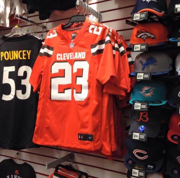
Well, it's official folks
-
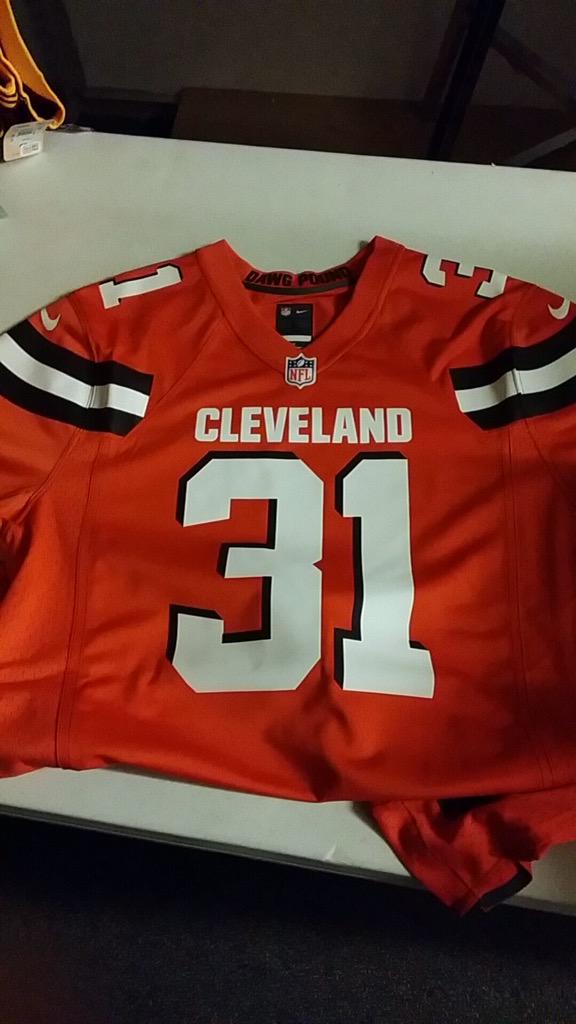
Here's your new #Browns orange jersey via @BiG_CLE_FaN - not supposed to be on store shelves but are
-
-
mmmmmmmfffff

maybe they'll look better ON the player. uh....
great job nike!
not.
-
it looks like the stripe is cut off by the middle fabrics seam. Whereas in this picture below the stripe is cut at a point or in a triangle the one in the store just looks like it runs under the middle fabric at the seam... that looks like a hack job. Not saying its a fake just that it's poorly done.
http://i1.wp.com/theinscribermag.com/wp-content/uploads/browns2.jpg?zoom=2&resize=1021%2C580
-
Don't mind them but the 3D lettering is kind of lame. Did we finally just get to the 90s or something?






Hello! It looks like you're interested in this conversation, but you don't have an account yet.
Getting fed up of having to scroll through the same posts each visit? When you register for an account, you'll always come back to exactly where you were before, and choose to be notified of new replies (either via email, or push notification). You'll also be able to save bookmarks and upvote posts to show your appreciation to other community members.
With your input, this post could be even better 💗
Register Login