
browns board logo for hats…anyone?
-
-
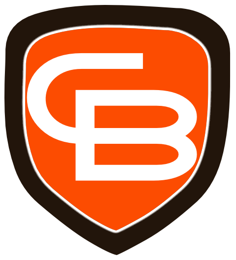
You mean like this?
yes chris, like that.
this is where we pick it apart tho, so let's understand these are up for criticism and let no one get their feelings hurt (sorta like in the real world of design
 )……..
)……..yeah, myself i like the intertwined letters look of like a baseball logo on the front of a ball cap. with the design you attached however i don't like the typeface. we'll take a look at both serif and sans serif fonts with different color fills and strokes to compliment the color of the hat. after looking at what's available on sale now i might be leaning towards a beanie and color options aren't specifically browns colors. i really like this one here tho:

it's made by champion so it's got their 'C' logo on it (side). no other color choices for this hat are appropriate as they are basically other team's color schemes or really off like carolina blue and navy etc. i can get a plain brown or orange ball cap for about the same price but it's not the quality of the champion beanie and i figure it's freakin cleveland ohio and it's cold as a witches's tit there in winter time so the beanie would prob be more practical, besides i like not sticking to the norm as far as color is concerned. as long as we're not sporting something with black or gold or something so profoundly another team's color scheme i say let's do that. it'd be a one of a kind original that you couldn't find anywhere else. and i wear beanies all the time over my shaved dome so i know a good one and this one for the price i can get it for now is pretty insane.
so if i was to get THAT beanie a dark brown wouldn't show up very well on the olive background unless it had a heavy stroke of white. let's throw some stuff together given that pic of the beanie and see what we look like after a couple of rounds of nitpicking
 .
. -
man what i'm coming up with looks like doodie. i might just stick with a one letter B (orange with white stroke). unless you guys can come up with something. then maybe just write out thebrownsboard on the back. embroidered on a beanie it'd just have to be the B as the small lettering would get lost in the fabric.
we'll see.
-
I've been away from my computer but I'll fire up illustrator when I get home.
-
You mean like this?

This is too reminiscent of the Boston Red Sox logo....which would not go over. This is the once upon a time proposed helmet logo from the early 60s. Perhaps some modified version of this could work. BB instead of CB...or CBB (Cleveland Browns Board). Just a suggestion.:

-
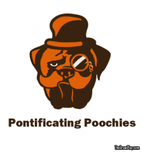
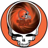
Other internet images I have found for the Browns.....some official some not. Just for ideas:


-

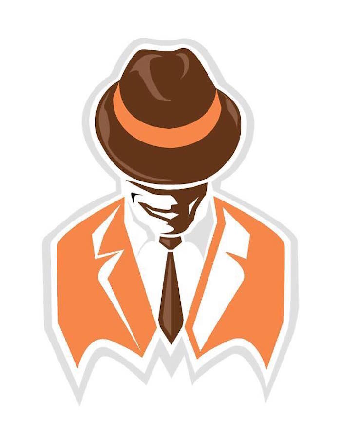
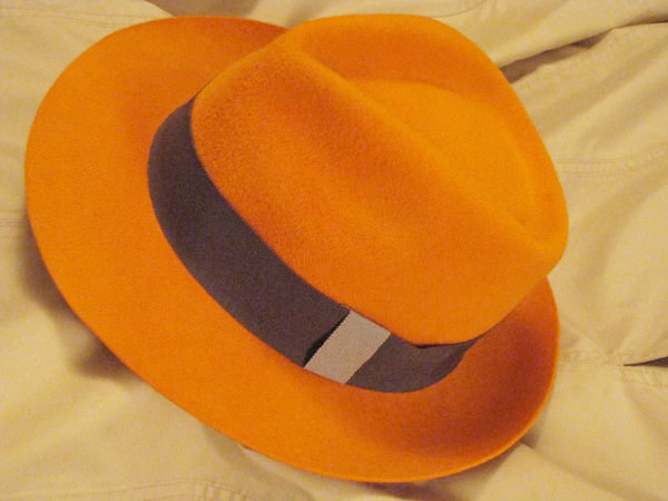
You want us all to look real cool.....make your hat a fedora:
-
You are talking about color scheme.....how about a two tone beanie:

I personally still prefer the old pumpkin orange, not the orange orange.
-
Let's face it.....put anything together if it can look like this:
-

-
Of course, you can design your beanie to just be like a Browns helmet:
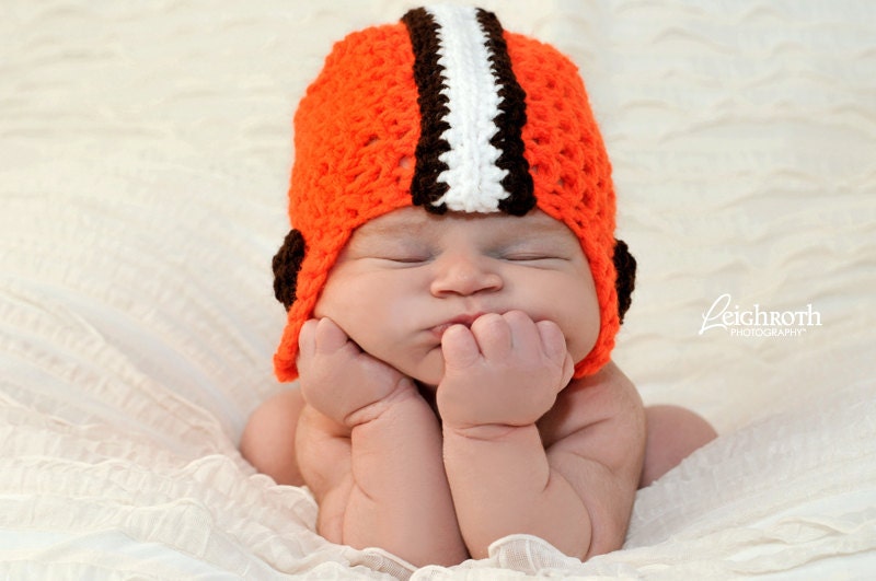
A little less baby ish.
-
Interesting one here with Superman like logo:

-
BB logos:
For our British Blokes, something like this:


Cleveland Browns Board
-
Maybe my new avatar?

-
Other internet images I have found for the Browns.....some official some not. Just for ideas:
Other internet images I have found for the Browns.....some official some not. Just for ideas:
like the one top left but who knows who did it and what type of copyright is attached.
-
Let's face it.....put anything together if it can look like this:
Let's face it.....put anything together if it can look like this:
like her i mean this one the best

-
Other internet images I have found for the Browns.....some official some not. Just for ideas:
like the one top left but who knows who did it and what type of copyright is attached.
like the one top left but who knows who did it and what type of copyright is attached.
Here seems to be a link to it:
-
-
Other internet images I have found for the Browns.....some official some not. Just for ideas:
like the one top left but who knows who did it and what type of copyright is attached.
like the one top left but who knows who did it and what type of copyright is attached.
The top left one was part of a redesign by Gridiron Labs, I believe. I stumbled across it a year or so ago and reached out to them on Twitter. I thought a lot of their work was great.
I was working on something very similar to what they did with the intertwined CB, actually.
http://gridironlabs.com/cleveland-browns/
EDIT: Didn't see Gip's post.


Hello! It looks like you're interested in this conversation, but you don't have an account yet.
Getting fed up of having to scroll through the same posts each visit? When you register for an account, you'll always come back to exactly where you were before, and choose to be notified of new replies (either via email, or push notification). You'll also be able to save bookmarks and upvote posts to show your appreciation to other community members.
With your input, this post could be even better 💗
Register Login