
browns board logo for hats…anyone?
-


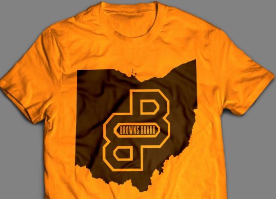
Just a few mock ups, like the minimalism of these. The one that doesn't say Browns Board is probably my favorite, because it's so simple.
-
Just a few mock ups, like the minimalism of these. The one that doesn't say Browns Board is probably my favorite, because it's so simple.
Just a few mock ups, like the minimalism of these. The one that doesn't say Browns Board is probably my favorite, because it's so simple.
dopeness! and i agree BUT i like the design aspect of the top one as well. i'm not limited to one color so the bottom design B config with a white stroke? and on the back we put THE BROWNS BOARD acroos the top in a 'varsity' font with some smarmy tagline(s).
thanks for your work dude, your stuff is really good.
i printed on orange last time and the feedback from my friends here was that people look like pumpkins when wearing them LOL.
-
yeah, I figured two or three screens wouldn't be a problem, I just really respond to the stark contrast and simplicity of just orange and brown. My favorite browns gear is the same way, no white, no black, but that's just a personal preference.
-
We should also honor Stockton with the tagline, something like "History will be kind to these posts"
or "God hates fags" -Diehardbrownsfan
-
yeah, I figured two or three screens wouldn't be a problem, I just really respond to the stark contrast and simplicity of just orange and brown. My favorite browns gear is the same way, no white, no black, but that's just a personal preference.
yeah, I figured two or three screens wouldn't be a problem, I just really respond to the stark contrast and simplicity of just orange and brown. My favorite browns gear is the same way, no white, no black, but that's just a personal preference.
that 'stark' contrast almost looks like a foil print. printing that is no problem except if using standard plastisol inks you're left with that heavy hand which can feel like a bullet proof vest in the summer time on a darker shirt like brown. i think we could accomplish a great look AND feel if i printed using discharge waterbased inks. it gives you a washed out vintage look and there is absolutely no hand to it. did it last time on a gildan 100% cotton dark brown:

-
-
Mik, if you want to take a simpler approach, I like having something big like the BB logo Royce came up with on the BACK, then maybe just "THE BROWNS BOARD" (just letters) on the front left chest. I personally don't like big designs on the front of t-shirts. On the back it's no problem. But I'll wear it either way.
-
I'm all for the vintage look
I'm all for the vintage look
hey man, let's enjoy the weekend and hit it again next week. i'll get my drunk friends together tomorrow and ask them about some tag lines. love the stockton idea. the one that he used to use that i always loved was the bud lite in a champagne league thing.
just not trying to say his name too much as he'll suddenly reappear IMO.
your work is much appreciated (and top notch) and whatever happens we'll be sportin something new in the fall.
-
Mik, if you want to take a simpler approach, I like having something big like the BB logo Royce came up with on the BACK, then maybe just "THE BROWNS BOARD" (just letters) on the front left chest. I personally don't like big designs on the front of t-shirts. On the back it's no problem. But I'll wear it either way.
Mik, if you want to take a simpler approach, I like having something big like the BB logo Royce came up with on the BACK, then maybe just "THE BROWNS BOARD" (just letters) on the front left chest. I personally don't like big designs on the front of t-shirts. On the back it's no problem. But I'll wear it either way.
I agree. Most of my 2 sided prints are with a front left chest print with a full back print BUT if you're getting it for free ????
If you want to help out think of something we could say on the back. It's gonna be a long weekend and I'm sure they'll be ideas that'll pop through our heads. And remember I don't want to put anything out there that the owners of this site find offensive.
-
Couple thoughts...
"www.thebrownsboard.com" belongs somewhere...
Potential Tag line: "Uncensored football talk since 19XX"
"When you have a shared vision it is a lot easier to make unpopular decisions." - Paul DePodesta "When you win, say nothing. When you lose, say less." - Paul Brown Complete 2017 Browns Board Mock: http://thebrownsboard.com/forums/index.php?showtopic=46196 -
Couple thoughts...
"www.thebrownsboard.com" belongs somewhere...
Potential Tag line: "Uncensored football talk since 19XX"
-
This is a brilliant idea about the hats etc, Mik.
I just don't have any ....good.... ideas to add to the mix.
The URL is very smart an idea. Although, with the brown on
a hot day being pretty steamy, and the orange = look like a pumpkin connection...
maybe a white t-shrt, similar to a Browns white jersey?
the colors would stand out...
Well, I admitted I didn't have any good ideas,.....
-
Couple thoughts...
"www.thebrownsboard.com" belongs somewhere...
Potential Tag line: "Uncensored football talk since 19XX"
-
This is a brilliant idea about the hats etc, Mik.
I just don't have any ....good.... ideas to add to the mix.
The URL is very smart an idea. Although, with the brown on
a hot day being pretty steamy, and the orange = look like a pumpkin connection...
maybe a white t-shrt, similar to a Browns white jersey?
the colors would stand out...
Well, I admitted I didn't have any good ideas,.....
This is a brilliant idea about the hats etc, Mik.
I just don't have any ....good.... ideas to add to the mix.
The URL is very smart an idea. Although, with the brown on
a hot day being pretty steamy, and the orange = look like a pumpkin connection...
maybe a white t-shrt, similar to a Browns white jersey?
the colors would stand out...
Well, I admitted I didn't have any good ideas,.....
understood. i think the fact that the season starts in the fall and you'd be wearing them during the season, a brown shirt is no biggie (and if it's 100% cotton at least it breathes......i wear mine all the time in the summer). besides in my experience i wear a white shirt once or twice and then it's never the same, not even considering the ketchup, mustard or wine spills on white???? HA!!
btw, appreciate any help. people don't have to be a designer to have great ideas. the more opinions involved the better off i'll feel knowing i got input from a wide spectrum of people.
(THNXS!)
i'd like to get input from some mods so i know wear the line is drawn when it comes to a tag line. i wouldn't mind being specific about "the #1 brown's fan forum. uncensored football talk since ____ (as tour suggested). but i also like a little smarmy as long as it's still family friendly. (i mean i'd make a different version if it was for the friday or saturday night before the game. but wives and kids go to the game so....)
-
Just a few mock ups, like the minimalism of these. The one that doesn't say Browns Board is probably my favorite, because it's so simple.
Just a few mock ups, like the minimalism of these. The one that doesn't say Browns Board is probably my favorite, because it's so simple.
Nice, though I think you could put a star or something where Cleveland is.
-
Just a few mock ups, like the minimalism of these. The one that doesn't say Browns Board is probably my favorite, because it's so simple.
Just a few mock ups, like the minimalism of these. The one that doesn't say Browns Board is probably my favorite, because it's so simple.
that 'stark' contrast almost looks like a foil print. printing that is no problem except if using standard plastisol inks you're left with that heavy hand which can feel like a bullet proof vest in the summer time on a darker shirt like brown.
I prefer the upper one with the BrownsBoard printed, but I think impression is mostly due to the double B's not being solid, but double outlined.
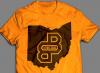
Agree on the feel of so much plastic ink on a tee... a design solution might be to use the Ohio silhouette as the "upper hole" in the forward-facing "B".
"When you have a shared vision it is a lot easier to make unpopular decisions." - Paul DePodesta "When you win, say nothing. When you lose, say less." - Paul Brown Complete 2017 Browns Board Mock: http://thebrownsboard.com/forums/index.php?showtopic=46196 -
Just a few mock ups, like the minimalism of these. The one that doesn't say Browns Board is probably my favorite, because it's so simple.
Nice, though I think you could put a star or something where Cleveland is.
Nice, though I think you could put a star or something where Cleveland is.
hopefully people will figure out that we're talking about cleveland when looking at the words brownsboard or cleveland. the placement of the double Bs in his mockups really leaves no room for a star and would take away from the major design element, IMO.
Agree on the feel of so much plastic ink on a tee... a design solution might be to use the Ohio silhouette as the "upper hole" in the forward-facing "B".
i'd print the big 'ohio' using a discharge ink. what that basically is is a water based ink with an chemical added to it that bleaches out the color of the shirt and replaces it with the color that is mixed with it in one felt swoop.
the problem floating around in my head now is whether to make the back a date specific event shirt or a 'brownsboard' website specific shirt. by making it date, opponent etc. specific people have something they can wear years from now and say they were at the game, besides i wouldn't have to worry about stepping on the toes of the people who are in charge here. BUT it'd also be nice to throw up the URL and a tagline. just don't know if it would be too busy.....
last one was a pretty simple back with date specific and usernames from people here.
-
Nice, though I think you could put a star or something where Cleveland is.
hopefully people will figure out that we're talking about cleveland when looking at the words brownsboard or cleveland. the placement of the double Bs in his mockups really leaves no room for a star and would take away from the major design element, IMO.
Agree on the feel of so much plastic ink on a tee... a design solution might be to use the Ohio silhouette as the "upper hole" in the forward-facing "B".
i'd print the big 'ohio' using a discharge ink. what that basically is is a water based ink with an chemical added to it that bleaches out the color of the shirt and replaces it with the color that is mixed with it in one felt swoop.
the problem floating around in my head now is whether to make the back a date specific event shirt or a 'brownsboard' website specific shirt. by making it date, opponent etc. specific people have something they can wear years from now and say they were at the game, besides i wouldn't have to worry about stepping on the toes of the people who are in charge here. BUT it'd also be nice to throw up the URL and a tagline. just don't know if it would be too busy.....
last one was a pretty simple back with date specific and usernames from people here.
hopefully people will figure out that we're talking about cleveland when looking at the words brownsboard or cleveland. the placement of the double Bs in his mockups really leaves no room for a star and would take away from the major design element, IMO.
I think a cap that spells out Browns Board on the front with both B's large font
Orange with brown lettering and white outline around the letters and/or Brown with orange lettering and white outline.
Simple.
-
hopefully people will figure out that we're talking about cleveland when looking at the words brownsboard or cleveland. the placement of the double Bs in his mockups really leaves no room for a star and would take away from the major design element, IMO.
I think a cap that spells out Browns Board on the front with both B's large font
Orange with brown lettering and white outline around the letters and/or Brown with orange lettering and white outline.
Simple.
Zombo said:
I think a cap that spells out Browns Board on the front with both B's large font
Orange with brown lettering and white outline around the letters and/or Brown with orange lettering and white outline.
Simple.
after checking prices with my embroiderer, i've all but cancelled the hat idea.
i mean i like you guys and all but i don't like you that much, lol.
from here on out it'll just be a surprise when stan opens the box.



Hello! It looks like you're interested in this conversation, but you don't have an account yet.
Getting fed up of having to scroll through the same posts each visit? When you register for an account, you'll always come back to exactly where you were before, and choose to be notified of new replies (either via email, or push notification). You'll also be able to save bookmarks and upvote posts to show your appreciation to other community members.
With your input, this post could be even better 💗
Register Login