
A little fashion chat
-
Ridiculous. The Browns have no logo. Orange is a color, not a logo. You can register a logo. You can't register a color. Time to bring back the Brownie and make him a testosterone fired up badass.
The Browns have no helmet logo...that is true. And while they do use the helmet to represent them a lot...I agree that it is not actually a logo. But they do have official logos that they do use on paraphenalia etc.
The Browns have no helmet logo...that is true. And while they do use the helmet to represent them a lot...I agree that it is not actually a logo. But they do have official logos that they do use on paraphenalia etc.
GIp, the helmet without a logo is an identity, it is a statement, literally, a trademarkable item.
I am not at all a fan of "The Dawgz" culture, simply because there is no historical connection to it. Dixon and Minnifield were exciting buffoons, but I don't see dawg related crap as part of this teams identity. The Bulldog is a testament to PB and Canton, not to Cleveland. If the team did install a logo, it can't be to recognize PB. He was an important part of the Browns, but he was not the root source of the Browns.
The only two graphic possibilities that can be legitimately considered are either the letters CB, or The Brownie. With the graphic tools we have today it would be very plausible to either use the CB, C or B, or make a non-gay Brownie. Perhaps the Brownie perched like King Kong on the top of the tower? Maybe a Brownie turned Terminator. I have no idea, but I for one would like the team to come up with a respectable logo that you and I could easily be suckered into buying new Browns crap.
The helmet is boring. For 2018? It really is bad.
The Cleveland Browns have the hardest hit players in the NFL -
I hope they go with a more traditional look next time.


Of course a little modern touch is needed, but don't gay them up like that last batch, keep it simple and clean.
I refer to the current unis as the "Manziel era" as we unleashed them when he was the "saviour". The Manziel fanboys and the uniform fags at the same time ... Oy Vey!
Can't wait for these to be gone and go back to a simpler look.
I remember one homo arguing with me that the team will perform better with new, updated uniforms, because the players will feel better in their new threads. LOL.
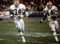
The Browns are 4-44 in these uniforms.
NFL should let us switch back now for the Mayfield era.
Zombo
Zombo said:
I hope they go with a more traditional look next time.
Of course a little modern touch is needed, but don't gay them up like that last batch, keep it simple and clean.
I refer to the current unis as the "Manziel era" as we unleashed them when he was the "saviour". The Manziel fanboys and the uniform fags at the same time ... Oy Vey!
Can't wait for these to be gone and go back to a simpler look.
I remember one homo arguing with me that the team will perform better with new, updated uniforms, because the players will feel better in their new threads. LOL.
The Browns are 4-44 in these uniforms.
NFL should let us switch back now for the Mayfield era.
Zombo
Browns helmet was made out of a bedpan. Not a lot of people knew that. That Spitzer homo had them pounded out and painted in one of his car dealerships.
-
I would prefer the browns not to look like the most boring football team that ever played.
I would prefer the browns not to look like the most boring football team that ever played.
And how exactly would a 1 - 31 team accomplish that?
-
I don't know if you're trolling or dumb as sh!t sometimes.
Let's put it this way: if you had the choice of wearing a three piece custom suit by Armani or homespun Amish clothes with the obvious seams all in the wrong place which would you feel more confident going out for the evening in?
This shit ain't nothing to me, man. -
The Browns have no helmet logo...that is true. And while they do use the helmet to represent them a lot...I agree that it is not actually a logo. But they do have official logos that they do use on paraphenalia etc.
GIp, the helmet without a logo is an identity, it is a statement, literally, a trademarkable item.
I am not at all a fan of "The Dawgz" culture, simply because there is no historical connection to it. Dixon and Minnifield were exciting buffoons, but I don't see dawg related crap as part of this teams identity. The Bulldog is a testament to PB and Canton, not to Cleveland. If the team did install a logo, it can't be to recognize PB. He was an important part of the Browns, but he was not the root source of the Browns.
The only two graphic possibilities that can be legitimately considered are either the letters CB, or The Brownie. With the graphic tools we have today it would be very plausible to either use the CB, C or B, or make a non-gay Brownie. Perhaps the Brownie perched like King Kong on the top of the tower? Maybe a Brownie turned Terminator. I have no idea, but I for one would like the team to come up with a respectable logo that you and I could easily be suckered into buying new Browns crap.
The helmet is boring. For 2018? It really is bad.
GIp, the helmet without a logo is an identity, it is a statement, literally, a trademarkable item.
I am not at all a fan of "The Dawgz" culture, simply because there is no historical connection to it. Dixon and Minnifield were exciting buffoons, but I don't see dawg related crap as part of this teams identity. The Bulldog is a testament to PB and Canton, not to Cleveland. If the team did install a logo, it can't be to recognize PB. He was an important part of the Browns, but he was not the root source of the Browns.
The only two graphic possibilities that can be legitimately considered are either the letters CB, or The Brownie. With the graphic tools we have today it would be very plausible to either use the CB, C or B, or make a non-gay Brownie. Perhaps the Brownie perched like King Kong on the top of the tower? Maybe a Brownie turned Terminator. I have no idea, but I for one would like the team to come up with a respectable logo that you and I could easily be suckered into buying new Browns crap.
The helmet is boring. For 2018? It really is bad.
Fair enough. I have said the same thing about the whole "Dawg" persona.....that it applied only to the Dixon/Minniefield defense...not every one since then.
It would be like the Rams calling all of their defenses "Fearsome Foursome" . But they only apply that to the Deacon Jones/Olsen/Grier/Lundy defense.
Or the Vikings calling all their defensed the "Purple People Eaters"...but that was only for Eller/Page/Larsen/Marshall.
I personally am fine with the no logo helmet. See my current avatar. That was a proposed helmet logo for them made back in the early 60s I think. They may have had it on their helmets for like 1 or 2 preseason games back then....but then dropped it.
I do like this logo for certain paraphenalia, etc. but not for helmets:

-
GIp, the helmet without a logo is an identity, it is a statement, literally, a trademarkable item.
I am not at all a fan of "The Dawgz" culture, simply because there is no historical connection to it. Dixon and Minnifield were exciting buffoons, but I don't see dawg related crap as part of this teams identity. The Bulldog is a testament to PB and Canton, not to Cleveland. If the team did install a logo, it can't be to recognize PB. He was an important part of the Browns, but he was not the root source of the Browns.
The only two graphic possibilities that can be legitimately considered are either the letters CB, or The Brownie. With the graphic tools we have today it would be very plausible to either use the CB, C or B, or make a non-gay Brownie. Perhaps the Brownie perched like King Kong on the top of the tower? Maybe a Brownie turned Terminator. I have no idea, but I for one would like the team to come up with a respectable logo that you and I could easily be suckered into buying new Browns crap.
The helmet is boring. For 2018? It really is bad.
Fair enough. I have said the same thing about the whole "Dawg" persona.....that it applied only to the Dixon/Minniefield defense...not every one since then.
It would be like the Rams calling all of their defenses "Fearsome Foursome" . But they only apply that to the Deacon Jones/Olsen/Grier/Lundy defense.
Or the Vikings calling all their defensed the "Purple People Eaters"...but that was only for Eller/Page/Larsen/Marshall.
I personally am fine with the no logo helmet. See my current avatar. That was a proposed helmet logo for them made back in the early 60s I think. They may have had it on their helmets for like 1 or 2 preseason games back then....but then dropped it.
I do like this logo for certain paraphenalia, etc. but not for helmets:
Fair enough. I have said the same thing about the whole "Dawg" persona.....that it applied only to the Dixon/Minniefield defense...not every one since then.
It would be like the Rams calling all of their defenses "Fearsome Foursome" . But they only apply that to the Deacon Jones/Olsen/Grier/Lundy defense.
Or the Vikings calling all their defensed the "Purple People Eaters"...but that was only for Eller/Page/Larsen/Marshall.
I personally am fine with the no logo helmet. See my current avatar. That was a proposed helmet logo for them made back in the early 60s I think. They may have had it on their helmets for like 1 or 2 preseason games back then....but then dropped it.
I do like this logo for certain paraphenalia, etc. but not for helmets:
I have a polo with that logo Gip, I like it. Hmmmmm..... FIWW, the ball caps they sent out to the season ticket holders last year as thank you trinkets ARE grey with the standard orange helmet on the front. Test marketing for acceptance?
-
-
I don't know if you're trolling or dumb as sh!t sometimes.
Let's put it this way: if you had the choice of wearing a three piece custom suit by Armani or homespun Amish clothes with the obvious seams all in the wrong place which would you feel more confident going out for the evening in?
I don't know if you're trolling or dumb as sh!t sometimes.
Let's put it this way: if you had the choice of wearing a three piece custom suit by Armani or homespun Amish clothes with the obvious seams all in the wrong place which would you feel more confident going out for the evening in?
First, tread lightly when insulting Ghoolie. Jcam222 has a crush on him, and gets very salty when you insult him.
Back to the topic... Go to Google Images and type in "Cleveland Browns Concept Uniforms". You will see a ton of uniforms random people have come up with over the years for new Browns unis.
Post a couple you like so we can kind of get an idea of what you would like to see...
-
I expect a TON of polling and design competitions. Like, leave no stone unturned type of stuff. We need to get this right and everyone knows it. Now, what right IS...that's a giant problem. There's a large part of me that likes our orange helmets with the stripe. I don't want something tacky and childish like a milk bone drawn on the sides, but I DO want to see as many options as possible, ya know?
As far as the uniforms are concerned, I'll never know how we screwed that up. Didn't we pay some company millions of dollars to "design" for us, only for us to basically wear white every week? That's so dumb (although I COULD be mistaken about hiring a design company, so don't quote me). Still, how difficult can designing new uniforms be?! You know what I've found? Many fans really like our orange uniforms! I'm not saying we wear them EVERY week, but lord...how about SOMETIMES. And probably not orange jerseys with orange pants, that's a bit much. Orange with white looked good, right? I thought our brown uniforms were very good too. They might be my favorite. Brown jersey, brown pants with orange stripe down the side. Not hard.
As far as the uniforms are concerned, I'll never know how we screwed that up. Didn't we pay some company millions of dollars to "design" for us, only for us to basically wear white every week? That's so dumb (although I COULD be mistaken about hiring a design company, so don't quote me). Still, how difficult can designing new uniforms be?! You know what I've found? Many fans really like our orange uniforms! I'm not saying we wear them EVERY week, but lord...how about SOMETIMES.
I read something last year that said Jimmah wasn't happy with the criticism of the "new" designs, so that's why they wore white last year just about every game. Uh, we're not the Dallas Cowboys, mix it up please. I don't like the Ratbirds and Steelers coming in here with their home unis on.
I agree on the orange tops, I think they look great.
Personally, this so-called poll had us at #32. They didn't poll me, because IMHO the Dolphins, Jaguars, and Bills have the ugliest uniforms in the NFL, maybe in all of sports.
-
GIp, the helmet without a logo is an identity, it is a statement, literally, a trademarkable item.
I am not at all a fan of "The Dawgz" culture, simply because there is no historical connection to it. Dixon and Minnifield were exciting buffoons, but I don't see dawg related crap as part of this teams identity. The Bulldog is a testament to PB and Canton, not to Cleveland. If the team did install a logo, it can't be to recognize PB. He was an important part of the Browns, but he was not the root source of the Browns.
The only two graphic possibilities that can be legitimately considered are either the letters CB, or The Brownie. With the graphic tools we have today it would be very plausible to either use the CB, C or B, or make a non-gay Brownie. Perhaps the Brownie perched like King Kong on the top of the tower? Maybe a Brownie turned Terminator. I have no idea, but I for one would like the team to come up with a respectable logo that you and I could easily be suckered into buying new Browns crap.
The helmet is boring. For 2018? It really is bad.
Fair enough. I have said the same thing about the whole "Dawg" persona.....that it applied only to the Dixon/Minniefield defense...not every one since then.
It would be like the Rams calling all of their defenses "Fearsome Foursome" . But they only apply that to the Deacon Jones/Olsen/Grier/Lundy defense.
Or the Vikings calling all their defensed the "Purple People Eaters"...but that was only for Eller/Page/Larsen/Marshall.
I personally am fine with the no logo helmet. See my current avatar. That was a proposed helmet logo for them made back in the early 60s I think. They may have had it on their helmets for like 1 or 2 preseason games back then....but then dropped it.
I do like this logo for certain paraphenalia, etc. but not for helmets:
I have said the same thing about the whole "Dawg" persona.....that it applied only to the Dixon/Minniefield defense...not every one since then.
It would be like the Rams calling all of their defenses "Fearsome Foursome" . But they only apply that to the Deacon Jones/Olsen/Grier/Lundy defense.
Or the Vikings calling all their defensed the "Purple People Eaters"...but that was only for Eller/Page/Larsen/Marshall.
Well said.
I see nothing wrong with the Dawg Pound end zone however. It's not a logo. It's an end zone.
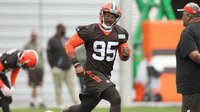
On a related note......I read today where the players will have to earn their helmet stripes this year. I'm assuming there's guys wearing orange helmets with no stripes.


Hello! It looks like you're interested in this conversation, but you don't have an account yet.
Getting fed up of having to scroll through the same posts each visit? When you register for an account, you'll always come back to exactly where you were before, and choose to be notified of new replies (either via email, or push notification). You'll also be able to save bookmarks and upvote posts to show your appreciation to other community members.
With your input, this post could be even better 💗
Register Login