
New "cutting edge" uniforms to be unveilled in 2015
-
nike is going for the bling effect which i particularly find over-the-top for a hard nosed football league. nike wants every team to have 10 different elements to their unis like the oregon ducks. might work for some teams but not for the browns.
-
The vikings redesign is ok I guess. That's the highest praise I can muster for them
-
May be in the minority here, but I would love an orange and silver color scheme. Always thought those colors looked great together.
once a fan, always a fan. married to a steeler fan. aaaaaaaaah! --andy -
@mike-h said:
I'm definitely in the minority, but I give zero fucks about uniforms.
Win games and look like douches ... Dont care as long as they don't suck anymore
Obviously fans would rather see the team win than wear new uniforms.
I'm asking, why does it have to be mutually exclusive? Why can't we both win games and wear new uniforms?
It's not like people are saying "these uni's will help us win".
-
yes orange and silver do look great together. too bad silver has no part in the original browns color scheme. brown, orange and white. that's it. do whatever you want to do with those colors. high gleam on the helmet with a gradient......fine. new jerseys with different stroke colors around the numbers depending on home/away unis..........fine, no probs. orange pants, brown pants, white pants.....love 'em all.
adding different colors and having halftone dots on the jersey fading from one color to another....no. too much.
the browns are original. old school.
would you want penn state to have lion paws on their shoulders? with the blue to white gradients? come on. there's some things you just don't touch. maybe we should weld the cracks of the liberty bell together so it's more appealing to the eye.
GTFO.
-
I'd rank them Vikings, Dolphins, Seahawks, Buccaneers, then Jaguars. I think the Vikings is nice because it's not over the top. Its kind of a nice plain look with a unique font. The Dolphins updated their teal color and it looks fantastic. Seahawks are hit or miss. Love the all blue, but other combinations are lacking. Buccaneers are rough. I do dig the orange being more prominent now. Jaguars. Terrible. The helmet alone will make blind people cry.
-
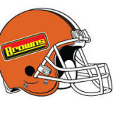
Well, we don't even have a primary logo, plus there isn't much to our uniform, so I am guessing Nike can't really mess it up. If they wanted to add a silver accent in there or something that would be alright.
-
-
-
May be in the minority here, but I would love an orange and silver color scheme. Always thought those colors looked great together.
May be in the minority here, but I would love an orange and silver color scheme. Always thought those colors looked great together.
That there is liberal faggotry. Murica.
-
-
I'm lukewarm on the new uniforms out there so far. Matte finish on the Vikings helmets I like. Seahawks unis I'm back and forth. Buccaneers latest is strange. Really large jolly rogers on the helmets, maybe too large, and the numbers look like old school calculator or digital alarm clock displays. Teams like Dolphins with teal as a primary color...there's no help for them. I like our orange and brown, and seeing any teams with teal makes me thankful for what we have.
-
by "cutting edge" they probably mean we are gonna want to grab the edge of a table and start cutting our wrists...
-
-
How would you guys feel about matte finish on the helmets? I believe we'll see this
This shit ain't nothing to me, man. -

Just think what may happen if the Jacksonville Jaguars are converted to the Los Angeles Leopards.
Like the Bengals with their Tiger striped helmet, we will get leopard print helmets.
-
Cheerleader uniforms could be OK though:

-
XxDaBuckeyexX said:
Have they announced whether or not we'll update the logo also?
Geez I hope not.
WSS
www.westsidesteve.com www.myspace.com/westsidestevemusic www.cdbaby.com/artist/westsidestevesimmons -
-
How would you guys feel about matte finish on the helmets? I believe we'll see this
How would you guys feel about matte finish on the helmets? I believe we'll see this
I'd have to see a preview of it first, but I like the Vikings use of it so I'd probably like it. If they insist on a change that is.




Hello! It looks like you're interested in this conversation, but you don't have an account yet.
Getting fed up of having to scroll through the same posts each visit? When you register for an account, you'll always come back to exactly where you were before, and choose to be notified of new replies (either via email, or push notification). You'll also be able to save bookmarks and upvote posts to show your appreciation to other community members.
With your input, this post could be even better 💗
Register Login