
Brown pants on the road??
-
The only thing worse than the white jersey and brown pants was the brown jersey and orange pants. Holy Christ that was ugly. Brown jerseys and brown pants would be absolutely horrific.
I'm with whoever said we should wear all white for all 19 games. I'll take the occasional Brown Jerseys with the white pants just for a change of pace..maybe once or twice out of the 16 games. But white on white the rest of the time for me...
-
I wonder if theres anything we the fans can do to push for numbers on the helmets
-
@shepwrite said:
Seriously, Mark? You like the white on white?Do you use condiments on your sandwiches? Do you like boiled fish?
Seriously I like the white on white... and no I don't use condiments on my sandwiches since you're asking. I like boiled lobster if that counts.
Don't tell me that you liked the orange and brown or god forbid the brown/brown combo that we;re talking about?
-
orange pants[/color]orange pants
-
The Brown pants need a stripe. I like the white/orange/white idea and it needs to be thick. Then I'd be okay with them.
No orange jersey. EVER. PERIOD. It's hideous and we are not the Bengals, who truly have the worst uni's in football.
I like the numbers on the helmets. I could probably get used to that fulltime.
Orange pants only for the two throwback games. And only with brown tops.
White/white is classic and I like it but again only with thick stripes, top and bottom, to break up the white.
My favorite is brown top/white bottom though. It just looks like the Browns to me with that combo.
As for logo/mascot, I like the elf but only as a throwback/retro thing.
I HATE the current dog symbol. In fact, I hate the whole "dawg" thing totally, mostly because it's outdated. Like the elf, it should be relegated to throwback/retro status and should not be part of current marketing. The Dawg Pound is fine but as you old-timers know, it ain't the same anyway, so why pretend? In 20 years, no one will know or care what the Dawg Pound stood for and I don't see another Big Dawg taking over, do you guys?
I don't think any big logo or mascot are needed but I do think there's room to sell different forms of "Cleveland" and "Browns" like the script in the end zones.
I also think there should be a consistent CB logo, something blocky and old school, strong and classic and then an offshoot B logo. Maybe incorporate a football image somehow.
If I was the marketing guy, I'd play up the classic, working-class, blue-collar FOOTBALL aspects and make the lack of anything shiny and exciting a strength.
For reference, look at the White Sox return to their classic Sox logo and black and white pinstripe look after experimenting with all sorts of ugly, red and blue weirdness and "modern" logo from the 80s. (Ironically, that abandoned "modern" logo is now their primary throwback/retro logo.) They don't have a great mascot but they made their SOX logo iconic (with the help of gangsta rappers, of course). That's what the Browns need to do.
-
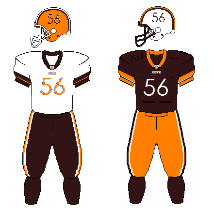
I am really bored so I tinkered around a bit. something like this
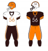 Like Granny always said- "If you can't be good...Be good at It."
 -
I am really bored so I tinkered around a bit. something like this
I like it Skinny - although I don't think Papa NFL will let any team have more than one helmet. And I also don't know if fans would embrace losing the pumpkinhead for half of the games. I'd be willing to give it a try, though. And I agree that making the numbers permanent on the sides is the only thing I'd allow there. Good stuff!
-
I am really bored so I tinkered around a bit. something like this
Change is good but some things aint broke so don't change em. White helmet = NO! Orange pants = NO, never again. Numbers / logos = NO!
Apart from that I support them to do what they like. Apart from any changes to the colours, stripes, logoless situation and colour combination of tops / pants. OMG, I hate change, don't I.
Let's get a winning team and I think the focus on peripheral pansy uniform changes will diappear. there is nothing wrong with our Unis, alot wrong with our performance. We've had this debate before, new unis does not equal field success. And I personally think we are the coolest looking bunch of football payers on the planet anyway.
-
I like white on white as well since we win more wearing the white.
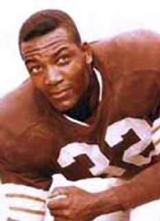
I don't mind the brown, but i wish they went back to the original brown which was several shade lighter in color.
-
How about adding a tannish color?
Tan??? Uh no, it's the Browns, not the Tans.
Tan??? Uh no, it's the Browns, not the Tans.
Or the Oranges!!
-
I think the Brown on Brown would be absolutely hideous..... I'm not a fan of the brown pants, but hell if we win when we wear them then I'm sure I would start to love them.
The white on white works for me....and an occasional Brown jersey white pants special look a couple times a season.
-
I for one love it. Remember Mangini is changing things here for the good in Cleveland, and this is also one of the good things.



Hello! It looks like you're interested in this conversation, but you don't have an account yet.
Getting fed up of having to scroll through the same posts each visit? When you register for an account, you'll always come back to exactly where you were before, and choose to be notified of new replies (either via email, or push notification). You'll also be able to save bookmarks and upvote posts to show your appreciation to other community members.
With your input, this post could be even better 💗
Register Login